
To purchase the PDF download, go to this page:
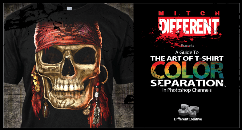
If you are a beginner or an intermediate artist and want to know how to do art for t-shirts and have the tools and knowledge that you will help guide you, then The Art of T-Shirt Color Separation is the best and least expensive way to start.
Photoshop is a fantastic program for designing art for T-Shirts. It is also a great tool to build Color Separations in Channels to make that design a great image on a T-Shirt. This book teaches how to accomplish that goal in simple and easy step-by-step exercises, using different methods to make these separations come back together on the press to duplicate the design on the computer.
More Than Just a Book! Discover How To:
• Separate colors for printing on black shirts
• Cross between RGB and CMYK channels
• Simulated and 4 color process
• Splitting channels to place separately into a vector program
• Outputting channels as an EPS composite from a vector program
• Create halftones without a rip software program
• Understanding the characteristics of individual channels
• The tools, palettes, hot keys and much more
No DVD! FULL Photoshop files are downloaded from the cloud at the click of a mouse as you need them for each exercise.
This is a design for an annual event that I have separated for many years. The client works with 3D models and then brings the images into Photoshop to compose a T-shirt design. My job is to separate the colors to print on the press. I do this manually without a separation program. This one took me about 2 hours. (Click on Picture to enlarge)
Original Photoshop Design


You have to think of color separations like the "Transporter" from Star Trek. It takes molecules, breaks them apart and sends them to a destination where it puts them back together again. With color separation, you take a design and decide how many colors need to print on the press that will simulate the original image. This requires a little experience and an eye for color. This particular design, I decided was 9 colors. So the goal is to break the design down into those 9 colors then reassemble those colors when they print on the press to end up with the image on the shirt.
Below is the sequence that the design prints on the press and is very similar to how it looks as it's printing. These images are demonstrating how each plate looks individually as the design comes builds back together. (Click on Picture to enlarge)
Original Photoshop Design

Print on a T-Shirt


You have to think of color separations like the "Transporter" from Star Trek. It takes molecules, breaks them apart and sends them to a destination where it puts them back together again. With color separation, you take a design and decide how many colors need to print on the press that will simulate the original image. This requires a little experience and an eye for color. This particular design, I decided was 9 colors. So the goal is to break the design down into those 9 colors then reassemble those colors when they print on the press to end up with the image on the shirt.
Below is the sequence that the design prints on the press and is very similar to how it looks as it's printing. These images are demonstrating how each plate looks individually as the design comes builds back together. (Click on Picture to enlarge)
Base White

Red

Pink

Yellow

Light Cyan

Blue

Based down Black for Mixing

Highlight White

25% Medium Black

Mitch Different is a working artist. He teaches and mentors talented artists who want to learn a field of art that is not covered in formal training at colleges and institutes. His resume' includes his own company, Be-Bop T-Shirt Shop, Carrousel Productions, Big Ball Sportswear, Sunline products, Different Creative and his freelance art on the Web. He currently resides at Canyon Lake, Texas.
Free Vector Downloads:
Much thanks to Terry Combs and Aaron Montgomery for inviting me as a guest on their
2 REGULAR GUYS
podcast show on January 10th.

Workshop for Live Hands-on Training


And, IMPRESSIONS magazine, click here Impressions

Special Thanks to Deborah Sexton for the great press! She has been a strong supporter for the Screen Printing Industry for many years through her articles and writing for many of the industry's top publications. . . Google her: Deborah Sexton


